Email design best practices
Email is an important way to communicate with an audience and it’s crucial to get the design right. Emails need a compelling harmony of copy, design, and must-click CTAs.
Why email design matters?
Great email design helps make your messages easier and more interesting to read. And those are both keys if you want to keep your subscribers opening your messages. Think of ways to frame your content that both highlights the most important parts and makes them as entertaining as possible.
Email design best practices
Almost 40 percent of emails are viewed for about eight seconds or fewer, so it’s essential to make it quick and easy for readers to see what’s important about your message. Strategically structured email content makes it clear to the reader what you want them to do. With good design, you can streamline your message to increase click-through rates and inspire action.
Tap into trends
A great place to start your email design is by tapping into current design trends to find inspiration. Many email campaigns use a multi-column layout. Separating content into two to three columns arranges it in a logical, grid-like structure.
Aim for clarity and be concise
Your audience is likely pressed for time, so make sure that your emails are clear, concise, and easy to read from a design standpoint. Use designs that a developer can build and modify with HTML to carefully curate content, so it shows up well on multiple email platforms. Text should be broken down into larger headlines and grouped with small digestible chunks.
Don’t break the inbox with your images
Use web-optimized images that load quickly. Images for emails rarely need to be wider than 800 pixels. Include descriptive alt text in case images break or your reader is using a program for people with visual impairment.
Use a design that guides the eyes downward
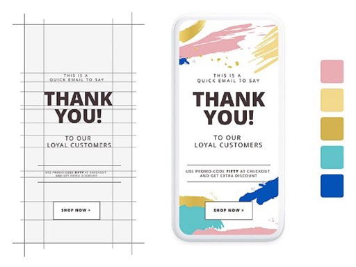
Your email layout should encourage the viewer to keep reading. Build a wireframe to plan out the visual elements of your email to ensure there’s downward momentum. An inverted triangle works well for a simple notification email, a zigzag shape for a stylish e-commerce email, and a neat and tidy column for an information-packed email newsletter. 
Be consistent with your branding
Weave your brand’s visual identity into your email designs to strengthen your organization’s brand recognition with each send. Use brand-consistent design elements, like your logo, color palette, typography, and other building blocks from your brand kit.
Optimize for mobile
As of July 2019, nearly 62 percent of email opens occurred on a mobile device. Responsive designs that translate well on any screen size are critical for an email campaign’s success.
Final Thoughts
As you create marketing emails, content should definitely be a priority. However, without good email design, the best copy simply will not be read by your audience. Create emails that are formatted for readability, use images to enhance your message, and ensure that your email copy is as easy to read as you can by implementing better email design principles. Discover software for designing emails ASk for creativity tool Source: Adobe


